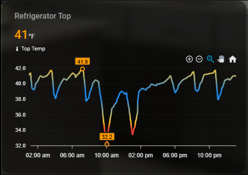
A sleek ApexCharts-based Home Assistant card for monitoring refrigerator temperature over the last 24 hours with smooth graphing, color-based safety thresholds, extrema markers, and a glass-style dark theme UI.
What's most interesting about this card is that it is designed for optimal refrigerator temperature band which is between 42 and 37 degress farenheit, if the temperature goes out of band the gradient will change color depending on the extremas.
note: emoji icons do not copy from the card code
Refrigerator Temperature Card
type: custom:apexcharts-card
experimental:
  color_threshold: true

graph_span: 24h

header:
  show: true
  title: Refrigerator Zone
  show_states: true
  colorize_states: true

all_series_config:
  stroke_width: 3
  type: area
  curve: smooth

series:
  - entity: sensor.fridge_zone_temperature
    name: "🌡 Temperature"
    type: line
    show:
      extremas: true
    color_threshold:
      - value: 34
        color: "#e53935"
      - value: 35
        color: "#fbc02d"
      - value: 38
        color: "#1e88e5"
      - value: 39
        color: "#1e88e5"
      - value: 42
        color: "#fbc02d"
      - value: 44
        color: "#e53935"

apex_config:
  chart:
    height: 220px
    zoom:
      enabled: true
    toolbar:
      show: true
      tools:
        download: false
        zoom: true
        zoomin: true
        zoomout: true
        pan: true
        reset: true

  stroke:
    curve: smooth

  fill:
    type: gradient
    gradient:
      shadeIntensity: 0.4
      opacityFrom: 0.6
      opacityTo: 0.05
      stops:
        - 0
        - 100

  grid:
    show: true
    borderColor: rgba(255,255,255,0.08)

  dataLabels:
    enabled: true
    style:
      colors:
        - "#fff"
    background:
      enabled: true
      borderRadius: 4
      borderWidth: 0
      opacity: 0.6

  tooltip:
    theme: dark
    shared: true
    intersect: false

  legend:
    show: false

card_mod:
  style: |
    ha-card {
      background: rgba(0,0,0,0.5);
      border-radius: 16px;
      box-shadow: 0 4px 12px rgba(0,0,0,0.4);
      backdrop-filter: blur(6px);
      color: #fff;
      padding: 10px;
    }
    .header {
      font-size: 1.2em;
      font-weight: 600;
      color: #1e88e5;
    }